The role of the color palette in shaping the emotional expressiveness of the frame
Authors
Beishembaeva Bella Bakytovna
Share
Annotation
The article is devoted to a comprehensive study of the role of color in creating expressive and emotionally charged images in cinema, photography and digital graphics. It examines the psychological aspects of color perception, its ability to enhance drama, emphasize the character of characters, set the pace and rhythm of a scene, and attract the viewer's attention. Special attention is paid to the interaction of the color palette with composition, light, texture and space, as well as how cultural codes influence the interpretation of shades. The article describes how color helps the author to create emotional accents, convey visual symbols and reveal deeper meaning in the frame. The authors give examples of contrasting and harmonious color combinations, as well as discuss techniques for creating a color script and shaping the overall style of a film or series of photographs. They emphasize that the skillful use of color is a powerful tool of artistic expression, which directly affects the perception and emotional response of the viewer.
Keywords
Authors
Beishembaeva Bella Bakytovna
Share
Relevance of the study
In modern visual culture, color is the most important means of expression. It is he who determines how the viewer will perceive the meaning, atmosphere and emotional overtones of the frame.
Modern color correction tools and the growing volume of visual content require a clear understanding: how exactly the color shapes the mood of the frame and strengthens its composition.
The relevance of this research is due to the need to systematize knowledge about color as a means of artistic expression, identify patterns of its impact on perception, and develop professional techniques for applying the color palette in areas such as cinema, photography, animation, and media art.
The purpose of the study
The purpose of the study is to comprehensively study the role of color as an artistic tool: to identify its importance in shaping the expressiveness and emotional tone of the frame, to analyze the mechanisms of psychological impact on the recipient, as well as to trace the influence of color solutions on the perception of plot, compositional and stylistic aspects of the image. Additionally, it is planned to study applied strategies for using color to enhance dramatic potential and create a holistic artistic image.
Materials and research methods
The materials science base of the study consists of representative visual sources: film frames photographic images, illustrative materials, as well as digital visual projects, including the results of color correction and computer graphics.
The methodological framework includes visual analysis, comparative historical method, psychophysiological and artistic‑aesthetic study of color perception, as well as the analysis of professional color schemes and industrial image processing technologies.
The methodological basis of the research is formed based on a systematic understanding of the theory of color, applied aspects of coloristics, compositional principles and methods of light organization of the frame. This interdisciplinary approach provides a comprehensive assessment of the effect of the color palette on the expressive qualities and emotional saturation of the visual image.
The results of the study
The history of studying the influence of color on the expressiveness and emotional component of an image has many stages and cultural layers. Its origins can be traced back to ancient philosophy, where ideas about color harmony and the natural properties of chromatic phenomena were formed.
Already in ancient Greece, philosophers paid special attention to color, considering it as a carrier of meaning and a means of influencing human perception. During the Renaissance, interest in color reached new heights thanks to artists who actively experimented with shades and contrasts, seeking to enhance the dramatic effect and create depth of space.
In the XVIII and XIX centuries, Goethe and Chevreuil created the first scientific theories of color. Goethe studied its psychological influence, and Chevreuil studied optical patterns. Their work formed the basis for subsequent research.
Although color science, the science of the nature of color and its basic properties, originated only in the 19th century, the characteristics of the color spectrum and the patterns of its perception have been studied since ancient times. The first scientific research in this field is considered the work of Isaac Newton. He approached the study of color from the point of view of physical color science. At the same time, Johann Wolfgang von Goethe, known for his philosophical writings, for the first time tried to explain how a person perceives color and what psychological reactions it causes.
With the development of photography and the advent of cinema, color has become an important expressive element, although cinema for a long time remained black and white, which stimulated theoretical research into color perception.
In the second half of the 20th century, with the arrival of color cinema and the expansion of technical possibilities, interest in colored drama increased, and filmmakers and cinematographers began to intentionally use color palettes to manipulate the emotional tone of a scene [1].
Since the 80s of the 20th century, photography has firmly taken its place in the context of modern art, which by that time had already clearly defined its artistic and creative principles. These principles can be clearly seen in the table in which modern art is compared with traditional (classical) art (Table 1).
Table 1
Comparative analysis of traditional (classical) and modern (contemporary) art [2]
|
Criteria of functionality |
Traditional (classical) art (painting, theater, choreography, music, etc.) |
Contemporary (current) art (non-specific, non-genre) |
|
The subject of art (the author) |
An outstanding personality with a special gift and unusual abilities is a true demiurge. |
The author does not exist as such. The subject of this work is a curator – interpreter with a design (technological) mindset. |
|
The process of artistic activity |
Intuitive, irrational, carried out on a whim, illumination from above (something from nothing), emotionally costly, demonstrating mastery of representation |
Logical, constructive, modeling, clearly following the set goal, rational, approving the presentation, the purpose of which is to problematize reality. |
|
A work of art |
The embodiment of value, a sacred and unique object that primarily affects human feelings. |
It cannot be considered as something material, it exists only in the form of an idea, a concept. |
|
Perception of art (process) |
It happens when a person who has received a work of art tries to understand the artist's intention. As a result, he may experience a sense of relief and joy. |
The viewer becomes a co-author of the project, creating his or her own aesthetic codes in the process of intellectual play. |
|
Art object (viewer, audience) |
A mass, profane, non-specialized, sensitive audience |
Highly specialized, trained, reflective audience. |
In the 2000s, deep visual research based on perceptual psychology, information design, and cognitive science was conducted. These studies have made it possible to systematize knowledge about the role of color in creating mood. Today, the concept of color expressiveness is considered at the intersection of various disciplines such as art history, media studies, neuropsychology and digital technologies. This interdisciplinary approach allows us to better understand the mechanisms of color effects and use them to create a vivid visual image in the frame.
It should be noted that in modern visual culture, color has become one of the key tools for managing the emotional perception of an image. This has become possible thanks to digital technologies, fine-tuning of color correction, and the development of perceptual psychology.
In modern cinema, advertising, video games and digital photography, the choice of a color palette is carried out for a reason, but taking into account a deep understanding of how different shades affect the viewer's perception. For example, in recent years, the cinema has often used the so-called "pastel" palette, based on the natural contrast between warm human skin and cold background shades. This approach gives the frames dynamism and visual appeal [5].
In the TV series Gone with the Wind, the color of the sky serves as one of the means of expressing the emotions of the main character. As the story progresses and the drama intensifies, the color of the sky reflects her feelings. In The Joker movie, the predominant shades of green and yellow enhance the feeling of decline and anxiety, creating an unsettling atmosphere that highlights the psychological instability of the protagonist.
The influence of color on a person consists of physiological and culturally determined reactions. Warm shades such as red and orange activate the sympathetic nervous system, increasing arousal levels and being associated with energy, danger or passion. Cold colors, such as blue and light blue, on the contrary, reduce emotional tension, creating a feeling of distance, emptiness or calm. Green is often associated with nature, but in a certain context, it can cause a feeling of decline or anxiety (Fig. 1) [4].
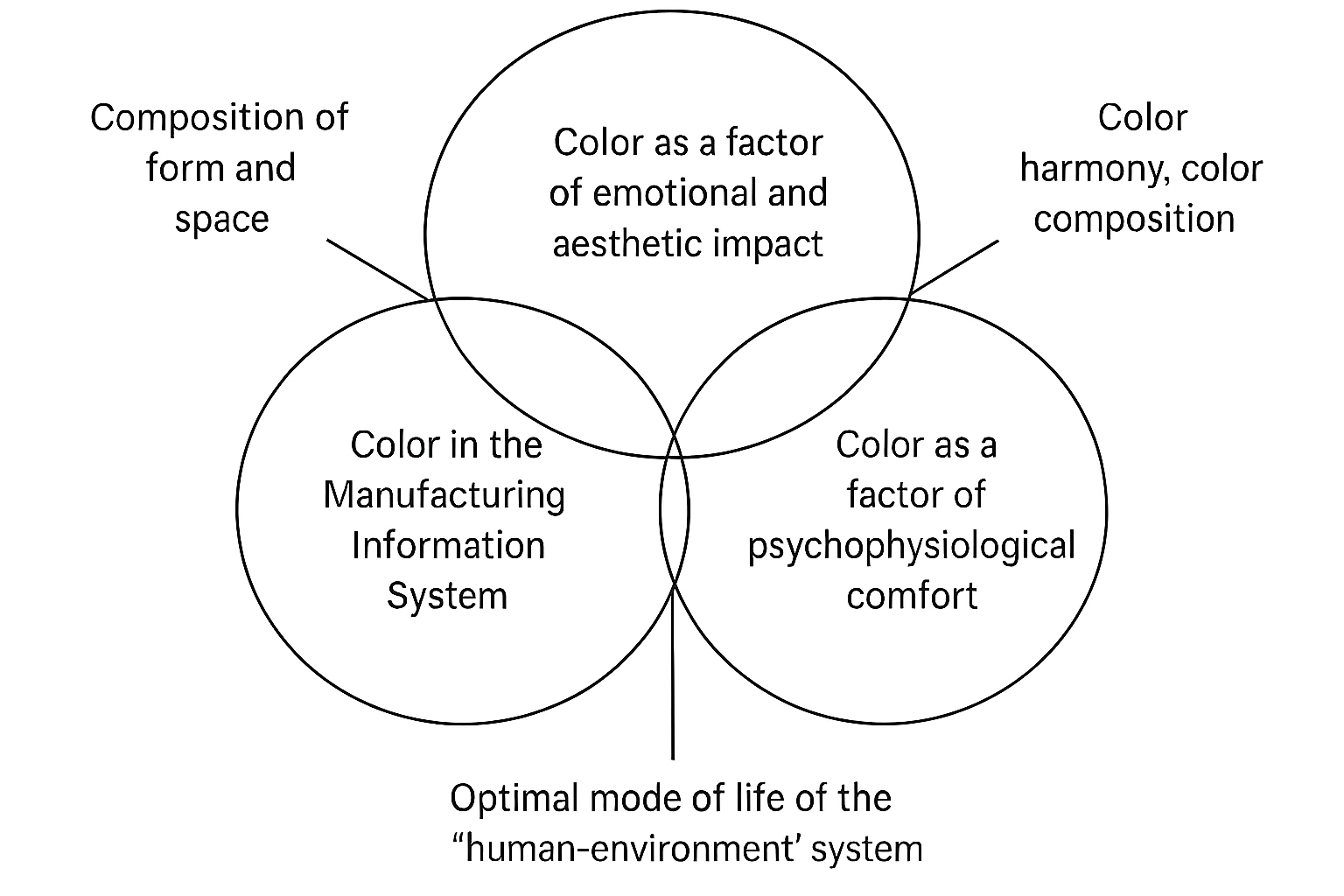
Fig. 1. The main tasks solved with the help of color
Modern color grading opens up new horizons in the art of creating an emotional atmosphere. By changing saturation, contrast, and hue, the authors can fine-tune the atmosphere of a scene, creating tension, romance, alienation, or dynamics.
In video games, digital color analysis algorithms adapt the palette in real time. In moments of danger, the picture becomes more contrasting and red, and in calm episodes, the saturation decreases, creating a soft visual field.
Modern examples of the use of color show that it has ceased to be just an aesthetic category, but has become a powerful tool of psychological influence, subtly controlling the emotional states of the viewer. Thanks to technological development and interdisciplinary research, the mechanisms of color influence have become more precise, meaningful and flexible. This allows the authors to create deeply expressive and emotionally intense images.
There are many techniques for working with color in photography that can help achieve the desired effect:
- Contrasting colors – is one of the simplest and most effective techniques. Contrasting colors placed opposite each other on the color wheel create bright and expressive compositions. For example, a combination of blue and orange or red and green can be very effective.
- Monochrome palette – this technique is used to create a unified atmosphere or accentuate a certain sensuality in photography. It involves the use of different shades of the same color, which create a harmonious composition.
- Accent color – is the use of bright colors in limited quantities against a more neutral palette. This technique allows you to draw the viewer's attention to the key elements in the photo.
- Color filters – are special programs that allow you to change the color of a scene or object in a photo. For example, a yellow filter can create a warm atmosphere, while a blue filter can create a cool one [3].
It is important to note that in the modern visual space, where digital technologies open up truly limitless horizons for working with color, the problems associated with its use to create expressiveness and mood in the frame become especially obvious.
One of the key difficulties is the excessive standardization of color solutions. The authors often follow fashionable palettes, such as the common combination of turquoise and orange. As a result, visual language loses its individuality and begins to be perceived as a template.
Another difficulty faced by filmmakers is the risk of emotional saturation of the frame. When the saturation and contrast of colors become too bright, they can tire perception and reduce the power of artistic impact. Often, the choice of color in a frame is determined not by drama, but by the technical capabilities of color correction. Because of this, expressiveness can become artificial, and emotional meaning can become superficial.
In addition, there are cultural limitations: viewers from different regions perceive the same colors differently, which can lead to unexpected reactions and a violation of the author's intention. Problems also arise when mixing light sources with different temperatures, which complicates palette management and may compromise the integrity of the visual style. In the digital environment, another difficulty is the different color rendition of screens: shades perfectly aligned on a professional monitor can be distorted on household devices, which disrupts the intended atmosphere.
All this makes working with color a complex and multifaceted process. Lack of attention or technical limitations can easily lead to a loss of expressiveness and emotional accuracy of the frame.
In our opinion, in order to effectively use color to create expressive shots and convey mood, it is necessary to combine artistic vision and technical skills.
One of the important stages is the development of the author's color concept at the preparatory stage. The author determines in advance the emotional objectives of the work and selects a palette that will reflect the storylines, characters and atmosphere. This approach allows you to avoid standard solutions and create your own unique visual language.
To avoid emotional overload, it is important to consciously control saturation and contrast. It is necessary to find a balance between expressiveness and naturalness, as well as to take into account the dynamic perception of color by the eye.
Another important measure is following the dramatic logic. In this case, the color solutions will be justified by the internal structure of the work and will not depend on fashion trends or technical effects. To account for cultural differences in color perception, it is necessary to research the target audience first. It is important to use universal emotional codes and carefully work with symbols so as not to distort the perception of the audience.
The technical difficulties associated with the different color temperatures of light sources are solved using a well thought out lighting scheme. It is important to use light sources with the same characteristics and accurately calibrate the equipment during shooting.
To minimize color distortion on various devices, it is recommended to use professional calibrated monitors, correct color profiles, and standardized workspaces. This will keep the palette stable for subsequent playback.
All these measures are aimed at restoring color to its main function – to be an expressive, accurate and emotionally justified tool for visual storytelling.
Conclusions
To understand how color affects photos, you need to understand its basic properties. Color can be described as the ability of objects or their surfaces to reflect a certain spectrum of electromagnetic waves. In photography, color is conveyed through a combination of three primary colors: red, green, and blue. These base colors can be combined to create a wide range of shades. But even with perfect mastery of photographic technique, it is always important to take into account the aesthetic perception of the future image.
One of the ways to use color in photography is to create contrasts that help attract the viewer's attention. For example, a black-and-white photograph may include one or more color elements that emphasize a particular detail or object. Also, strong contrasts between bright and dark tones can emphasize the shapes and lines of an object.
When choosing a color for a photo, it is important to take into account not only the emotions and associations that it evokes. It is equally important to consider the combination of shades, lighting, and other factors that can affect the perception of photography. The colors have a mutual effect on each other, varying in hue, lightness and saturation.
Competent work with color requires both artistic sensitivity and technical precision. Creating a well-thought-out color concept, paying attention to saturation, contrast and the light environment, as well as taking into account the cultural and psychological characteristics of perception make it possible to avoid randomness and visual noise.
Systematic control over all processes - from preparation to post-processing - ensures stability, expressiveness and consistency with the drama of color. Due to this, color ceases to be just a part of the image, but becomes the most important element of the semantic structure, which enhances the emotional effect and gives depth to the visual narrative.
References:
- Goethe I.V. The doctrine of color. Theory of cognition. Moscow: LIBROCOM Book House, 2012. 202 p.
- Guk A.A. Self-sufficiency of photography in the context of the functioning of modern art // Bulletin of the Kemerovo State University of Culture and Arts. – No. (68). – 2024. – pp. 166-174.
- Profitnova D. M. Color in photography as one of the main ways of emotional impact on the viewer // Actual problems of science and technology. Innovatika: Collection of scientific articles based on the materials of the XII International Scientific and Practical Conference, Ufa, May 26, 2023. Volume Part 3. Ufa: Limited Liability Company Scientific Publishing Center Bulletin of Science, 2023. pp. 58-64.
- Shmakova E.Y. Color in the creation of a plot-shaped concept of the film // Bulletin of the VGIK. – No. 14 (2 (52)). - 2022. – pp. 60-71.
- Shalimova L.A., Nasonova L.I. Theory of color study // Bulletin of BSU. – 2012. – No. 6. – URL: https://cyberleninka.ru/article/n/teoriya-izucheniya-tsveta
Other articles of the issue